Streamlining Home Service Transitions for Telstra Customers
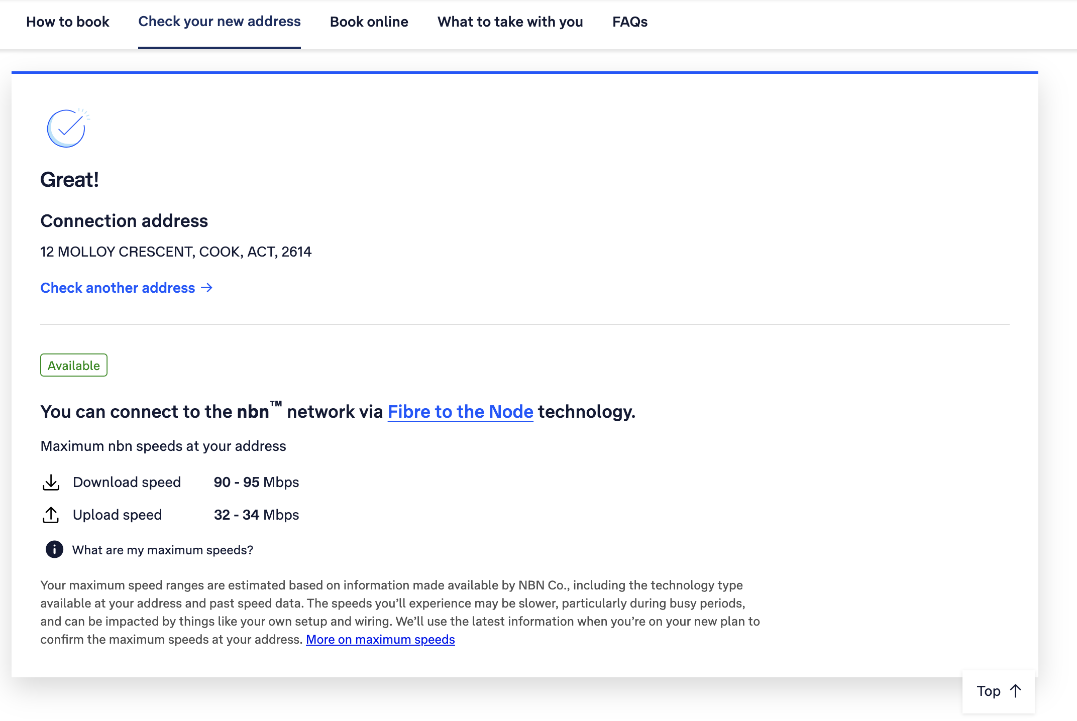
Telstra identified a need to improve the experience for customers moving homes and transferring their internet and digital services. The existing process relied on either lengthy forms or speaking with an agent, creating a less than ideal user experience. To address this, Telstra sought to develop a fully automated digital solution. This project aimed to leverage user research to design a streamlined and efficient experience for customers transitioning their services to a new residence.
ROLE
Product Designer
User Research, Interaction, Visual design, Prototyping & Testing
The Process
Our process at Telstra is based on the Double Diamond Theory and Lean UX process. We aim to incorporate the key phases of Discovery, Definition, Ideation and Implementation in all of our projects.
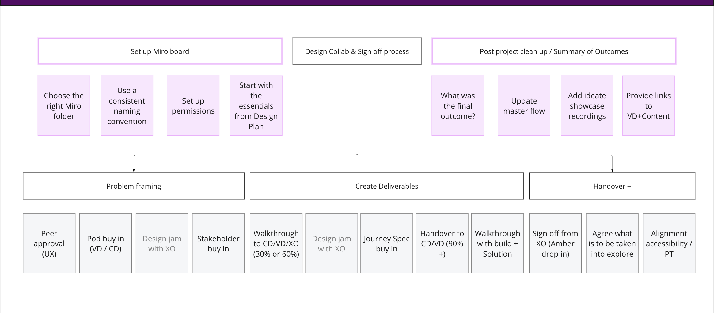
Understanding the problem
I conducted research interviews with our primary users to uncover any pain points that they were experiencing with the current journey.
My research encompassed:
Understanding the user goals and needs
Uncovering pain points with the existing user journey
Determining the success of the tasks measured

Research & Insights
After collecting the recordings from the user interviews, I conducted affinity mapping with my teammate to synthesise the pains identified. We grouped these problems under common themes and features in the platform.

I took the research findings and brainstorming notes to
UX critique sessions with the wider UX team
Web Accessibility group
Focus group sessions with internal senior stakeholders
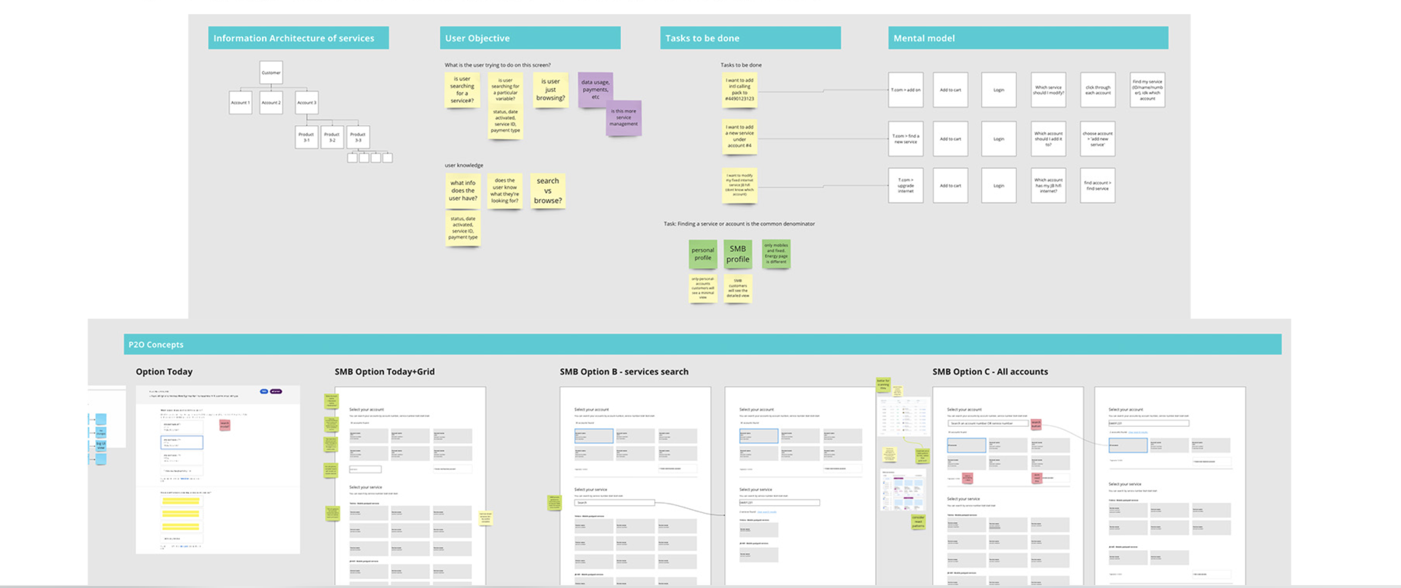
Wireframing
Right from the wireframing stage I engaged the UI designer and Content writers. We created a group and started discussing the findings so far and how they can contribute to the project.
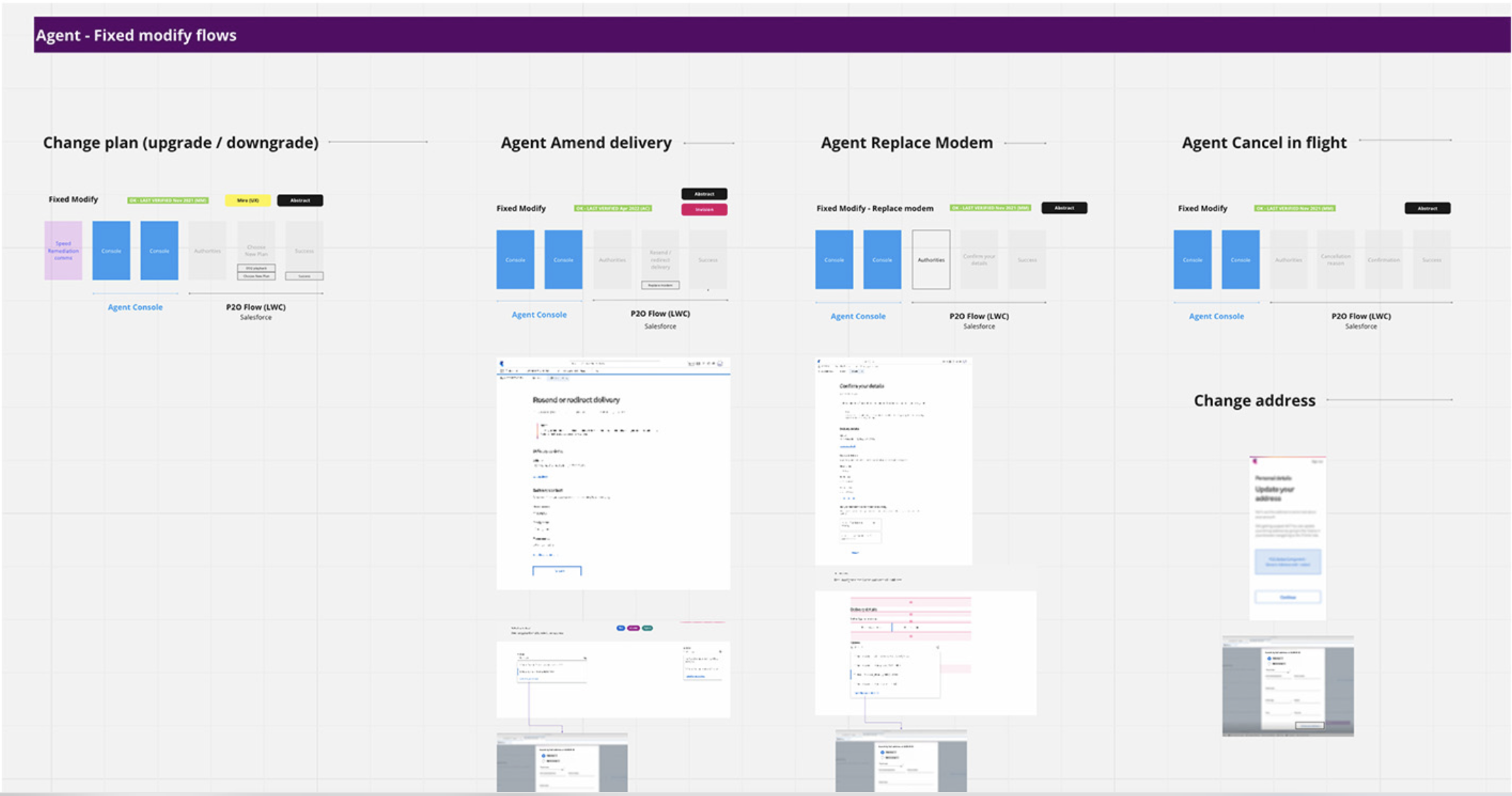

These wireframes are then taken to the Developers and Senior Architects and other Senior Engineers to discuss the feasibility.
Visual Design and Handover
After the Visual Designer and Content Writer have packaged their content, I presented at multiple forums to different stakeholders the final outcome and answered any questions for a smooth handover.
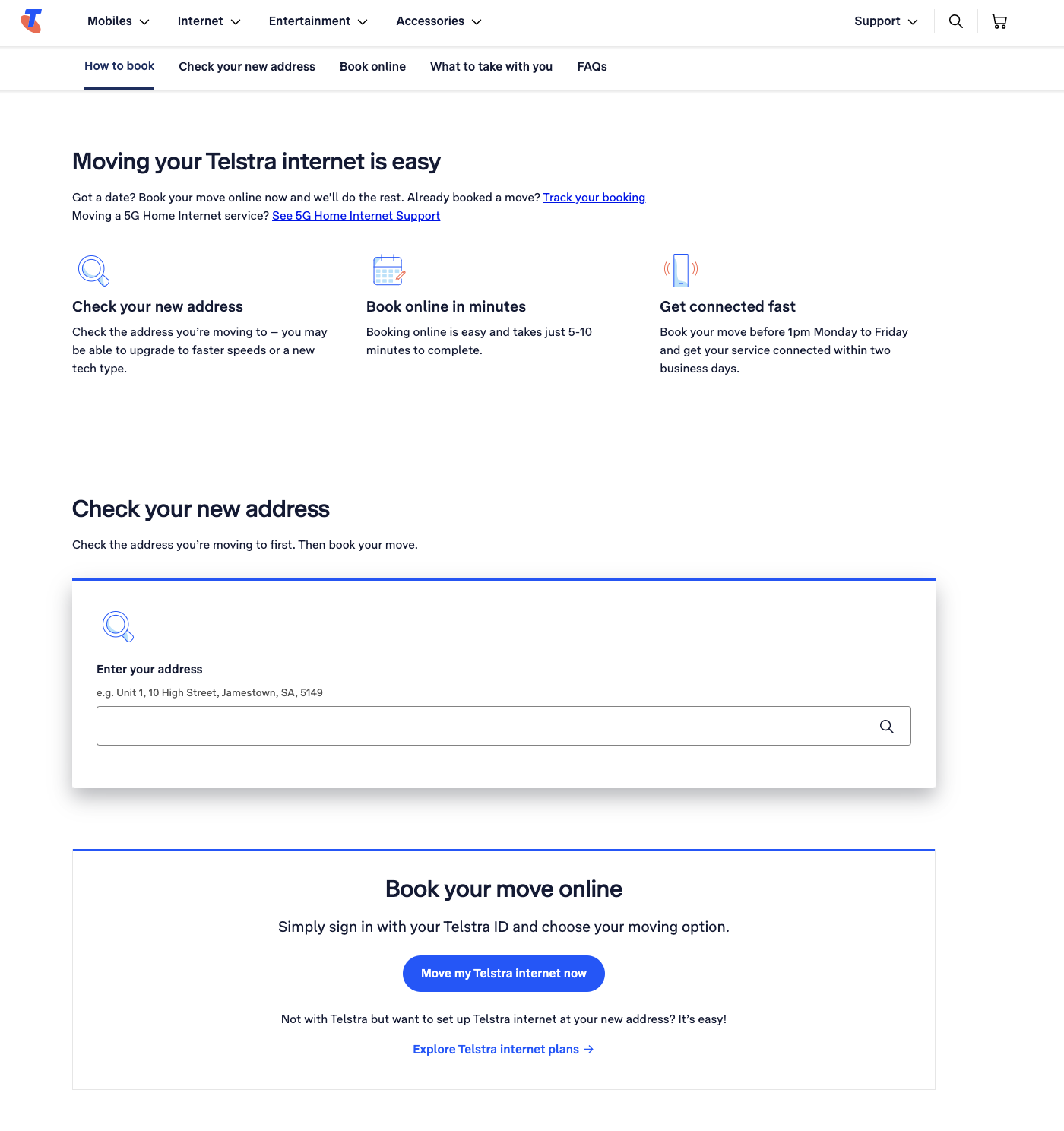
Results and Takeaways
Since the implementation of the new rebuild of the Moving Home, we have seen a significant decrease in the number of calls received through the service desk. Additionally, I have received positive feedback from users about the simplified configuration of their moving journey, saving them a large proportion of their time.
Some key takeaways from this project are:
Create a strategic plan to launch an MVP. This helps deal with out-of-scope requests that could potentially derail the project and helps deliver a quality product in time.
User testing doesn’t end after development. Design is a constant iteration of improving the experience for the end user. Always find ways to collect and listen to your user’s feedback.
Involve engineering upfront. This helps to reduce any rework later on as an understanding of the technical limitations upfront will help to inform your design strategy.


