Reinvigorating the Premier’s Reading Challenge
The Premier’s Reading Challenge website discouraged participation with its complex navigation, unclear book selection, and burdensome completion process. This UX project aimed to revamp the digital experience, making it engaging and user-friendly for children, ultimately boosting participation in the NSW Department of Education’s reading initiative.
ROLE
Product Designer
User Research, Interaction, Visual design, Prototyping & Testing
Background
The Premier’s Reading Challenge (PRC) is a flagship program of the NSW Department of Education, aiming to foster a love of reading among school children in New South Wales. However, the existing digital experience for the PRC was hindering participation.
Here’s a breakdown of the key challenges identified:
Limited User-Friendliness: Navigating the online platform proved cumbersome for children. Multiple links and unclear pathways made it difficult for them to access the PRC resources and functionalities.
Inaccessible Book Discovery: Identifying books eligible for the PRC was a challenge. The platform lacked a clear and user-friendly system for children to discover and select appropriate reading materials.
Burdensome Challenge Completion: The process of completing the reading challenge through the online platform was overly complex and discouraging for children.
These limitations were hindering the program’s effectiveness in engaging and motivating young readers.
Understanding the Usability Landscape: A UX Audit
Recognizing the limitations of the existing Premier’s Reading Challenge (PRC) website, the initial step involved conducting a comprehensive UX audit. This audit leveraged established usability heuristics to evaluate the user experience from a child’s perspective.
Usability heuristics are a set of principles that guide the design of user interfaces for optimal usability. By applying these principles, we could identify specific areas where the PRC website fell short and pinpoint opportunities for improvement.
User Research
Following the UX audit, we delved deeper with user research. This research aimed to gain a holistic understanding of how children interact with reading materials and digital platforms. We employed a multi-faceted approach to gather valuable insights:
Student Interviews (20 participants): We conducted in-depth interviews with a representative group of 20 school students. By directly engaging with the target audience, we sought to understand their experiences navigating libraries, their preferences for book discovery, and their attitudes towards reading challenges.
Teacher Interviews (5 participants): To gain an educator’s perspective, we interviewed 5 school teachers. These interviews explored teachers’ experiences facilitating the Premier’s Reading Challenge in classrooms and their insights into students’ challenges and motivations when it comes to reading.
Librarian Interviews (5 participants): Librarians play a crucial role in fostering a love of reading in children. By interviewing 5 librarians, we gained valuable insights into how children navigate libraries, their preferred methods for book selection, and the role libraries can play in promoting the Premier’s Reading Challenge.
By incorporating information on commonly used software and apps from student interviews, we could tailor the redesigned PRC platform to seamlessly integrate with children’s existing digital experiences.
This comprehensive user research approach provided rich data that would inform the development of a user-centered and engaging digital experience for the Premier’s Reading Challenge website.

Transforming Insights into Action: Synthesis and Collaboration
Following the insightful user research phase, we transitioned into a stage of synthesis and collaboration. This involved:
Data Analysis and Synthesis: We meticulously analyzed the data collected from user interviews. By identifying patterns and recurring themes, we were able to synthesize valuable insights into the needs and preferences of children, teachers, and librarians regarding the Premier’s Reading Challenge.
Brainstorming with Stakeholders: Leveraging the user research findings, we convened brainstorming sessions with internal stakeholders. This collaborative approach fostered a shared understanding of the user needs and allowed us to explore creative solutions for revamping the PRC website.
Requirements Definition (JIRA): As the Business Analyst (BA) for the project, I played a pivotal role in translating user needs and stakeholder input into actionable requirements. These requirements were documented using JIRA, a project management tool that facilitated clear communication and collaboration with the development team.

Developer Collaboration: Maintaining open communication with the developer was crucial. Through ongoing discussions, we ensured a clear understanding of the technical feasibility of proposed solutions and fostered alignment between design considerations and development capabilities.
By effectively synthesizing user insights, collaborating with stakeholders, and defining requirements, we established a solid foundation for the development of a user-centered and engaging platform for the Premier’s Reading Challenge.
Building the Foundation: Wireframing with Balsamiq
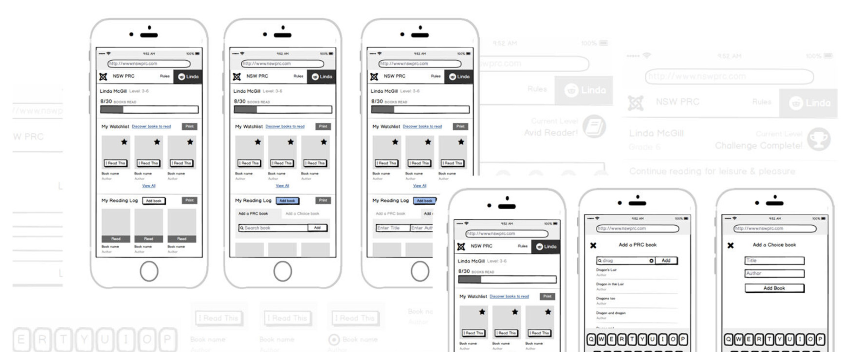
Continuing our progress towards an improved user experience, the next step involved the creation of wireframes. These wireframes serve as low-fidelity blueprints for the website’s interface, outlining the essential elements and functionalities.
In this project, I utilized Balsamiq, a popular wireframing tool, to:
Visualize Website Structure: Without getting bogged down in design details, Balsamiq allowed me to quickly sketch out the website’s overall layout and organization. This included defining page hierarchies, positioning key elements like navigation bars and search functions, and structuring sections for book discovery, challenge progress tracking, and other functionalities.
Focus on User Flow: By creating wireframes for different user journeys, such as browsing for books, enrolling in the challenge, and tracking reading progress, I could ensure a smooth and intuitive flow for children navigating the website.
Prioritize Usability: Balsamiq’s low-fidelity nature allowed for rapid iteration and testing of various layouts and functionalities. This focus on usability ensured wireframes were centered around child users’ needs and promoted an intuitive user experience.
These initial wireframes formed the foundation for the website’s design and laid the groundwork for usability testing in the next phase of the project.

Bringing it to Life: Visual Design and Style Guide
Following the development of wireframes, we transitioned into the visual design phase. The goal was to transform the wireframes into an engaging and visually appealing experience for children. Here’s how we achieved this:
Leveraging Existing Artwork: To maintain brand consistency and ensure visual alignment with existing marketing materials, we incorporated artwork from the illustrator who created flyers and other promotional content for the Premier’s Reading Challenge.
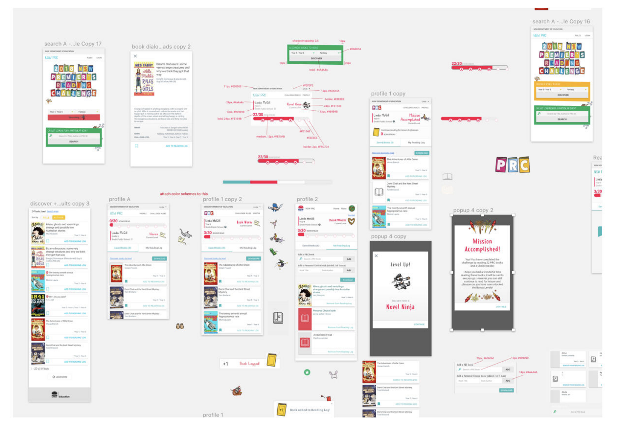
Developing a Visual Style Guide: Based on the existing artwork and user research insights, I created a visual style guide. This guide documented design decisions regarding color palettes, typography, imagery, and other visual elements. By establishing a cohesive visual style, we could ensure a consistent and appealing user experience throughout the website.
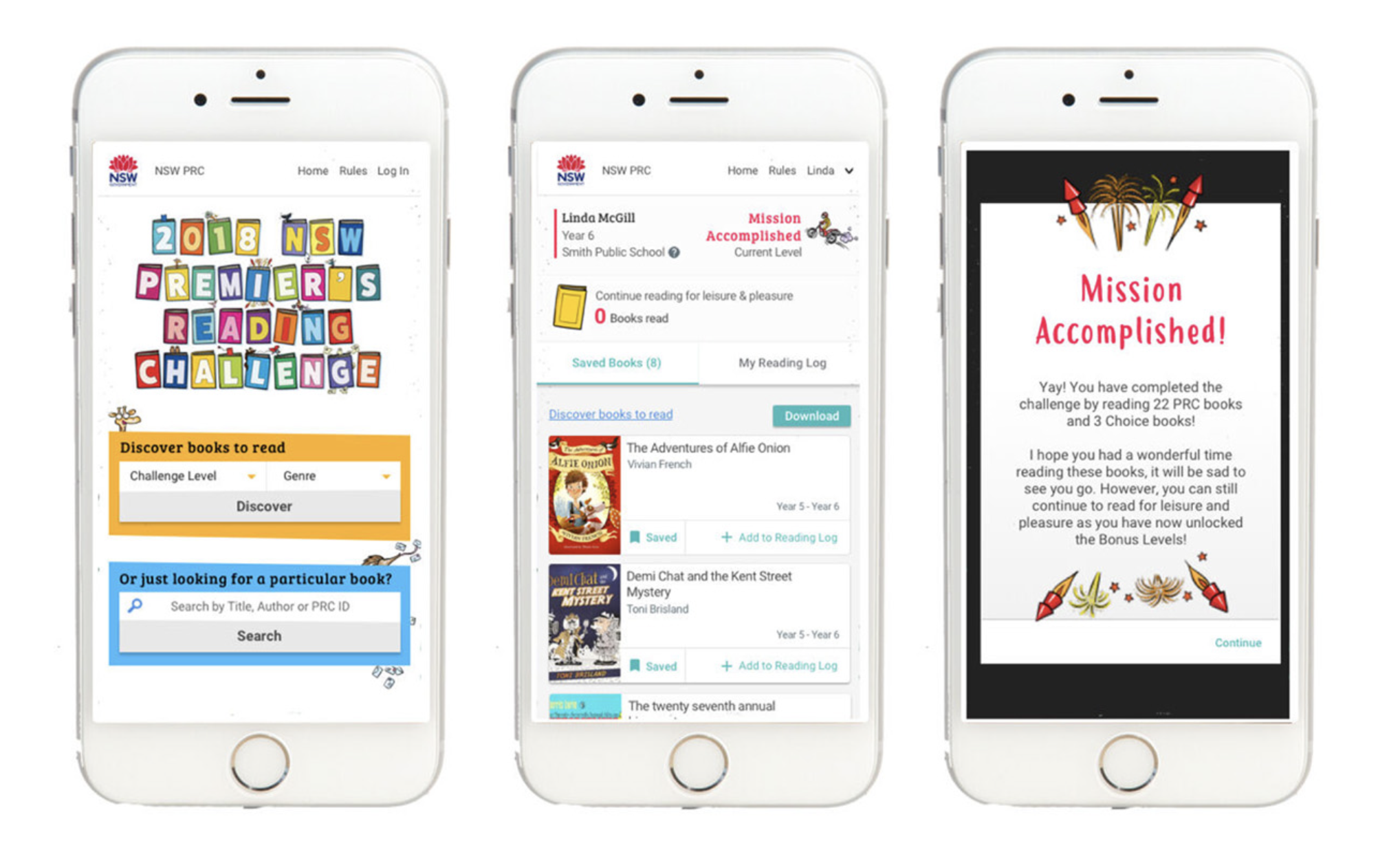
Building the Design: Utilizing the wireframes as a foundation and leveraging the visual style guide, we proceeded to design the website’s interface. This involved adding visual elements like illustrations, icons, and colors to create a user-friendly and engaging platform for children.
By incorporating existing artwork, crafting a comprehensive style guide, and meticulously designing the interface, we transformed the initial wireframes into a visually appealing and engaging digital experience for the Premier’s Reading Challenge website. This stage laid the groundwork for the final step – usability testing.

Results and Takeaways
Improved User Experience: Clear navigation, intuitive book discovery, and a user-friendly interface boosted child engagement.
Increased Student Motivation: Engaging visuals aligned with existing marketing materials fostered a more appealing environment for children.
User Research is Key: Understanding user needs through research leads to successful digital experiences.
Usability + Engagement: Balancing user-friendliness with visual appeal is crucial for children’s platforms.


